


Introducing:
TRACK
Navigating Bangkok Public Trains’ Multi Ownership Model with an intelligent webapp
Designed for Metamedia Technology Ltd (Bangkok, Thailand)
Responsibilities:
Product Designer
UX & UI Designer
Interaction Designer
Brand Strategist
Tools:
Figma
Adobe Photoshop
Adobe Illustrator
Miro
Jira
Results:
4.7/5 satisfaction rating from users
Delivered MVP to company and stakeholders
WHAT’S THE PROBLEM?
Bangkok’s public skytrain system belongs to a multi ownership structure consisting of government and private ownership, including private shareholders.
Thus, 2-3 different payment methods are used for competing agencies.
There are no solutions to create efficient travel solutions for trains across agencies
THE NETWORK
9 LINES
3 OWNERSHIPS
0 COLLABORATION
I interviewed 15 individuals traversing using the train, and have derived 2 personas from them

A traveller eager to visit all that Bangkok has to offer

And a resident Bangkokian, frustrated with the traffic


“The City’s changed, I don’t know how to get anywhere anymore”
“I have to get to work, but the route is never efficient enough”

“Why am I carrying 2 cards, aren’t these trains owned by the same people?”
As a culmination of my research, this Empathy Map allows me to see a bigger picture of what the problems are and how the users feel

DESIGN OBJECTIVE
To design an app that intuitively recommends the most accurate route from points A to B exclusively using public transport networks regardless of ownership
MARKET OBSERVATIONS
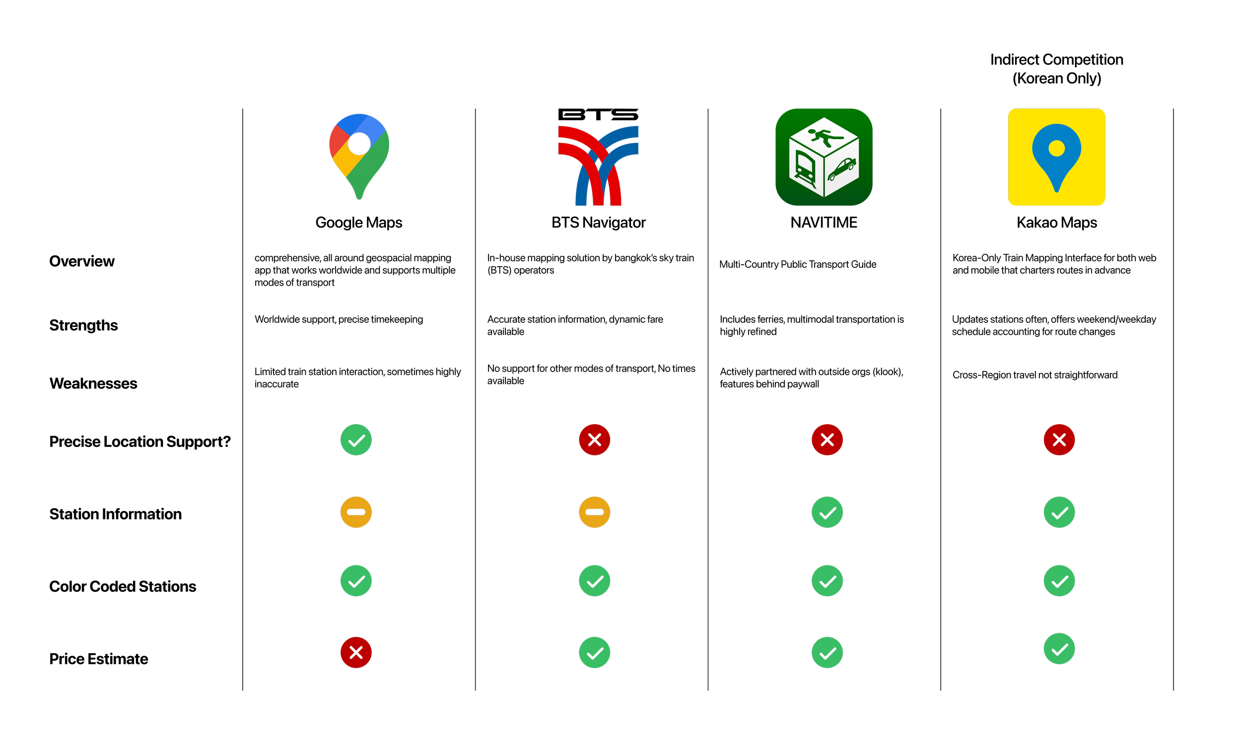
Here, I picked 4 major public transport focused map services, one of which being exclusive for South Korea, a country with similar train networks to Bangkok
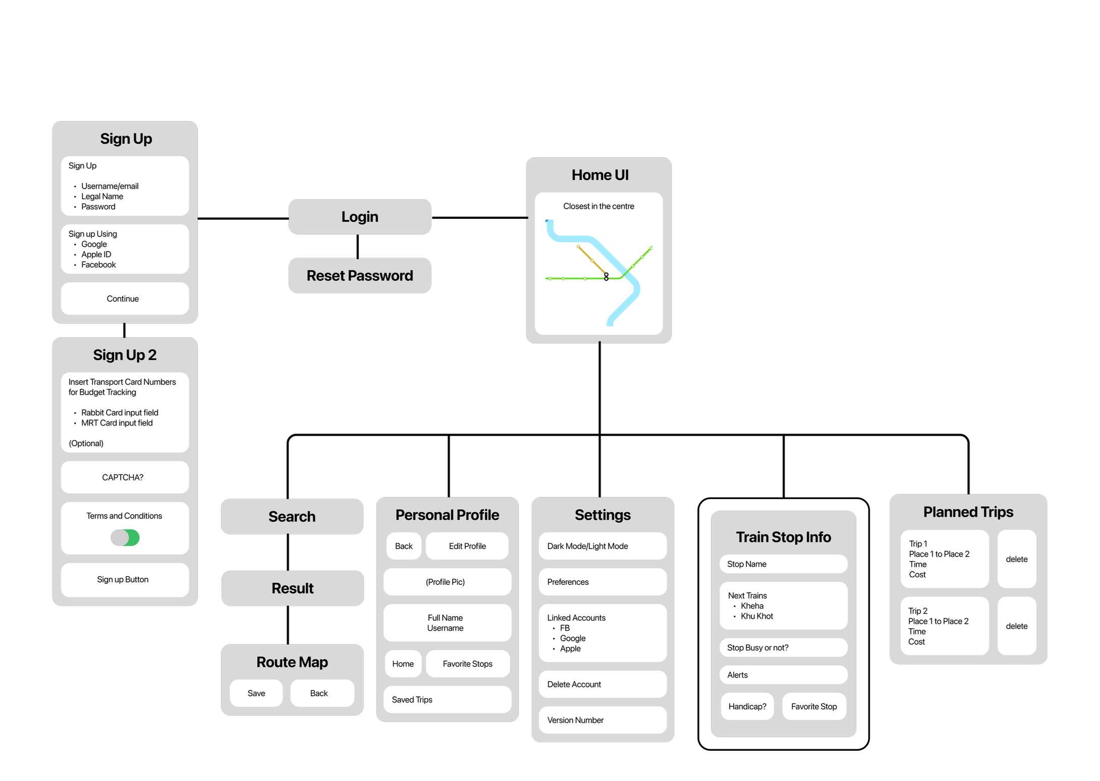
INFORMATION ARCHITECTURES
Through all my research, I was able to understand that users of public transport simply wanted to get from A to B as soon as possible while seeing the information they need. This allowed Track’s design to have a starting anchor point
These early stage wireframes determined where the widgets would be placed in context of web vs mobile to minimize interference on the map whilst still being visible and usable
Furthermore, the sizes of each page (ie settings) were determined from this exercise.
As this app is designed to be both vertical and horizontal adaptable, considerations were made for both
For mobile users, the app was made primarily with the map area in mind. This resulted in the information area being explicitly minimizable as a “card” from the bottom of the screen.
This enables two modes, one for map and station viewing and the other for route and information
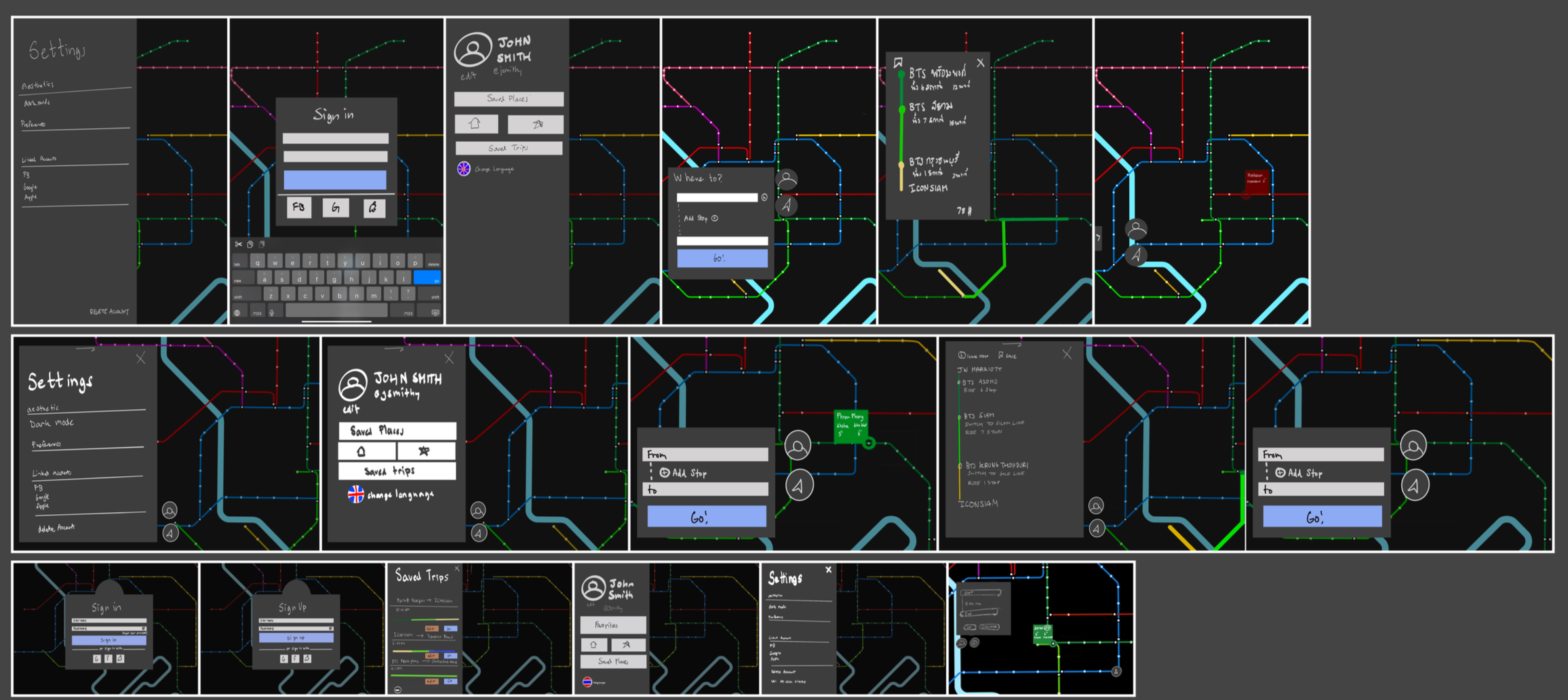
DECISION POINT
With 80% of people surveyed pre-wireframe reporting their primary app use in dark mode, I made the wireframe dark mode compliant.
Post wireframe AB testing resulted in light mode obtaining over 86% of approval due to how the lines’ colors reflect off the lighter background,
From here, digital wireframes were made to allow for rapid prototyping and changing the layout to match the UX.
This primarily gave me an idea of scale in how large/small the visual map idea was going to be
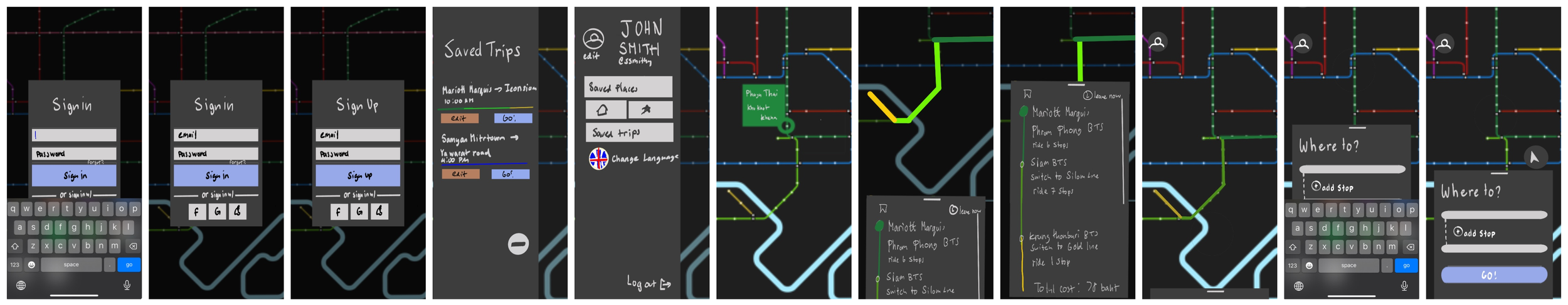
01: SIGNING IN


Signing into Track should be easy, both on web and app forms.
Users could either use an email-password combo or Facebook/Google sign-ins for ease of use
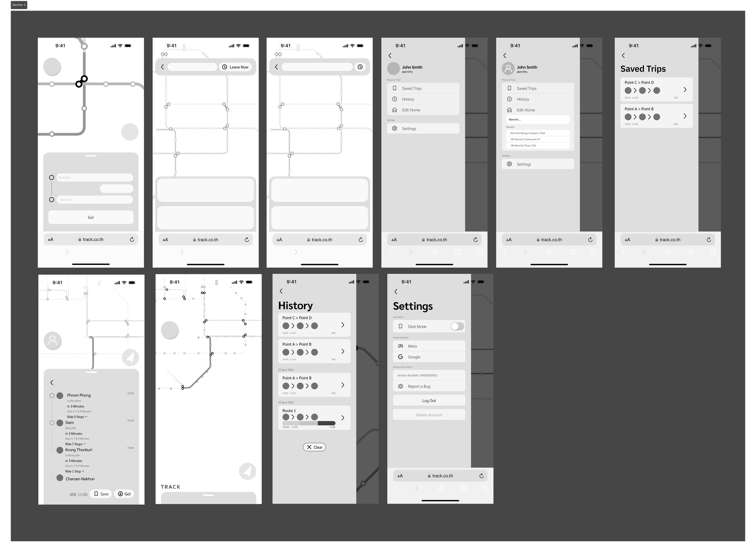
02: HOME

The home interface is primarily dominated by a simplified version of the train map, with visualizations of Bangkok’s Chao Phraya river as a throughline. The app uses location services to pinpoint a “starting” position centered around the closest station to you upon opening the app.
The grey overlay is visible and can be hidden at will for further exploration of the map, with a recenter button at a convenient position to be clicked on
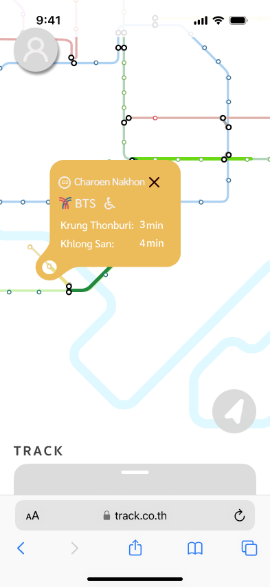

Station information will come into view as soon as you click or tap on their designated stops.
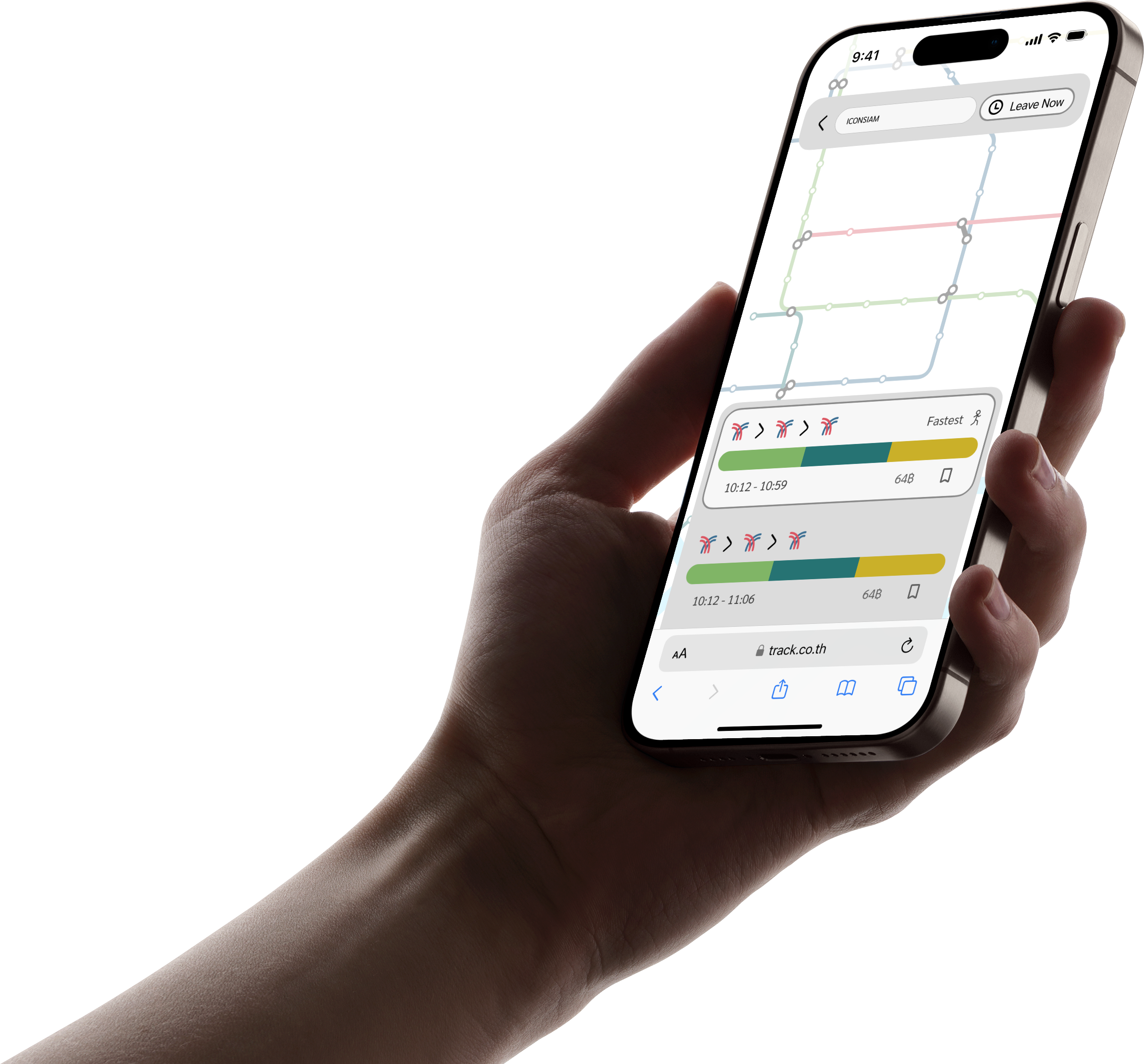
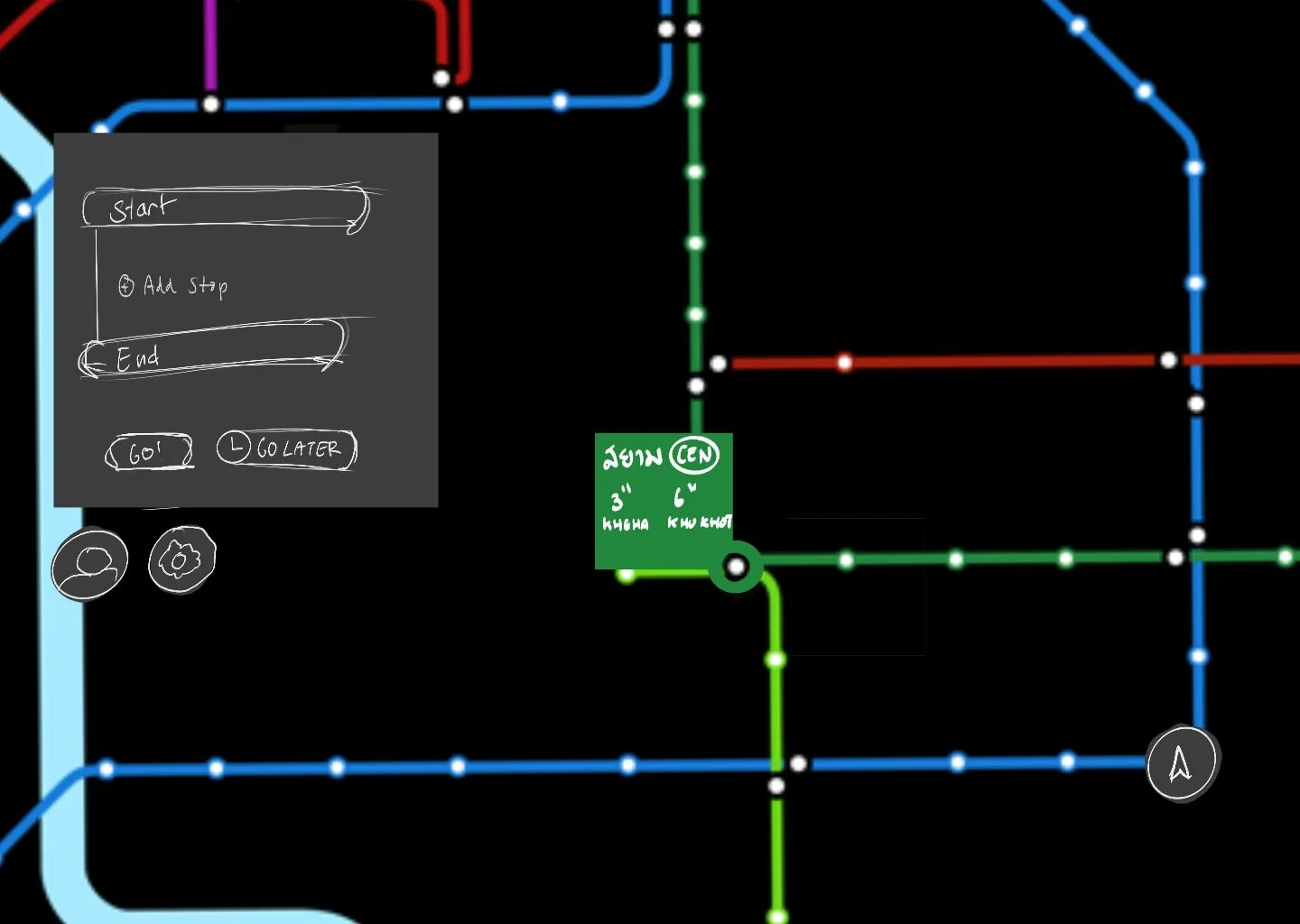
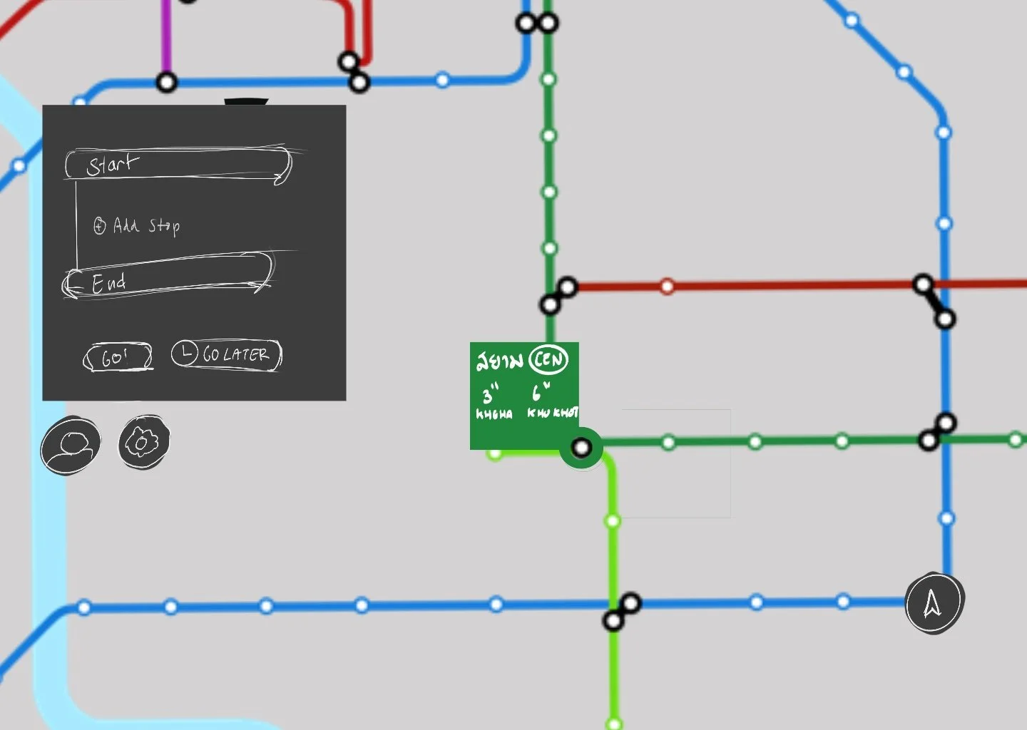
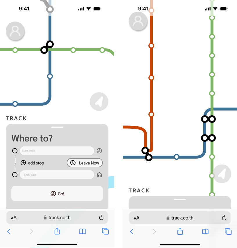
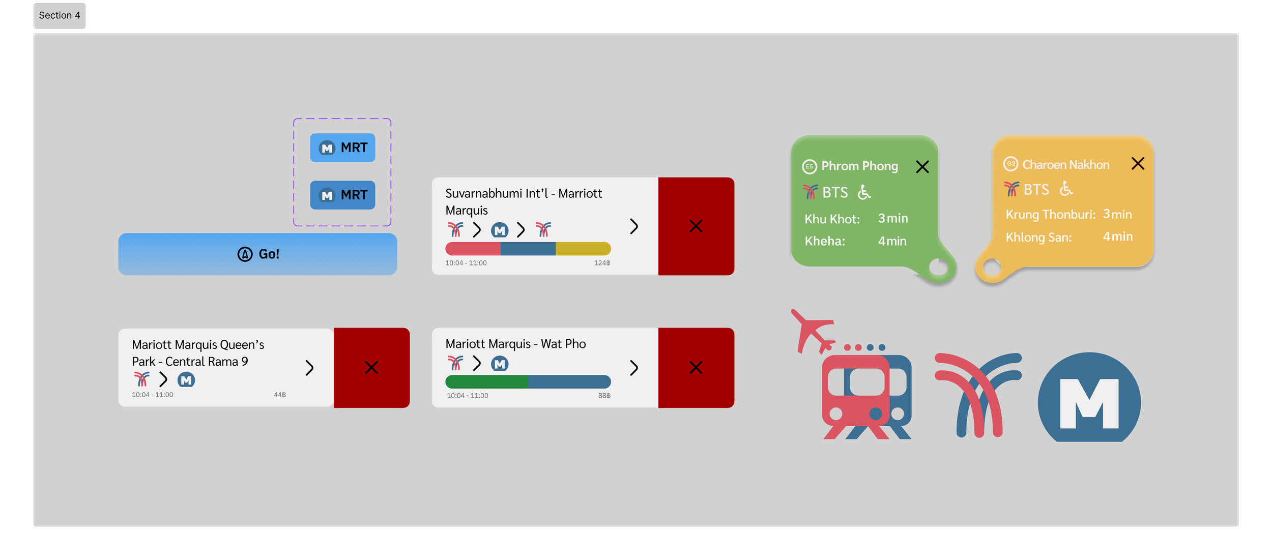
03: GOING SOMEWHERE?

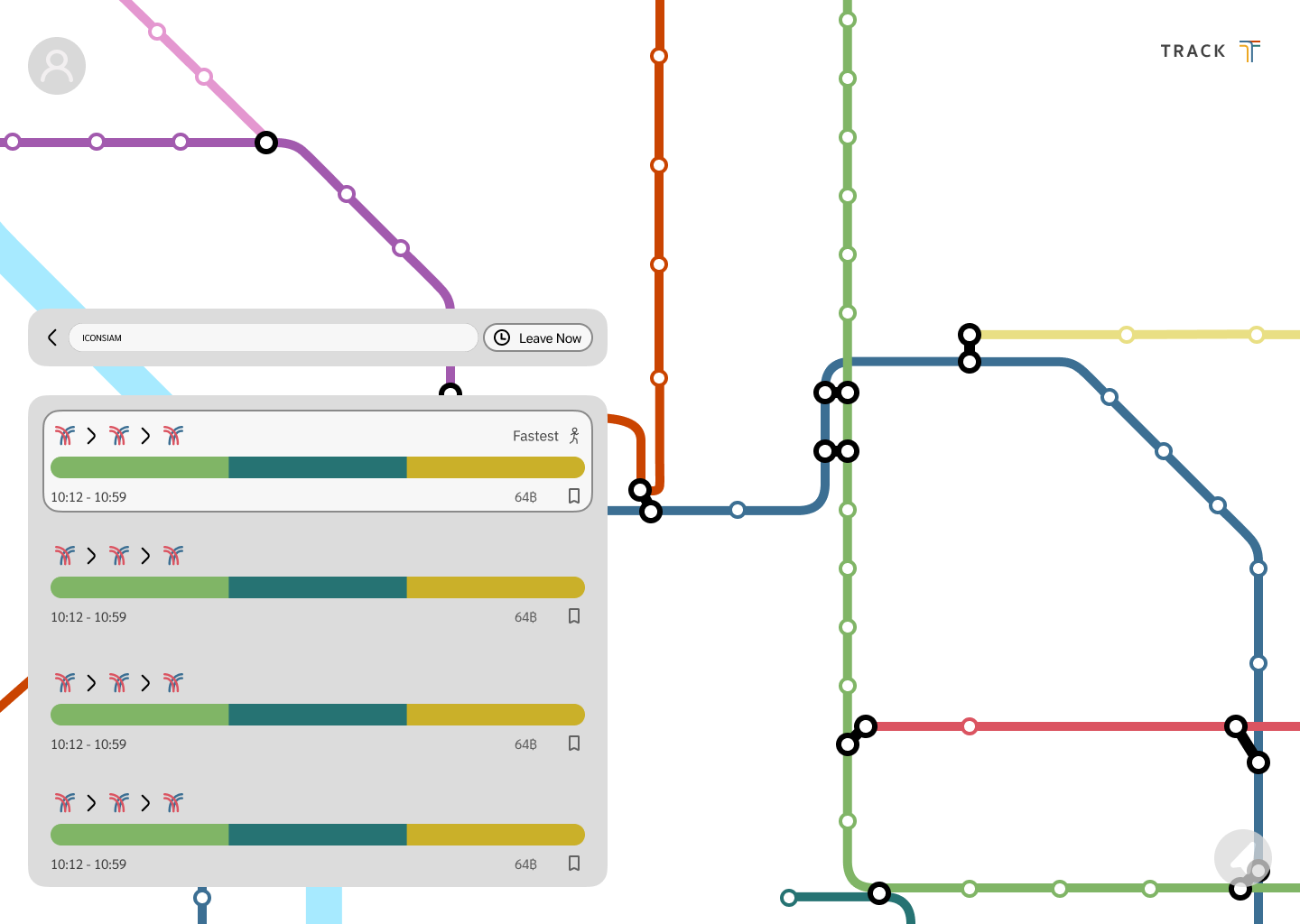
To get somewhere, it’s as easy as searching your starting point and end point in the prescribed search bar.
Adding stops along the way is also no sweat. The app generates multiple routes for its users, with the best one being highlighted for cost and speed efficiency.
The route can also be viewed visually as well, offering a clear view of which trains to take, and where.


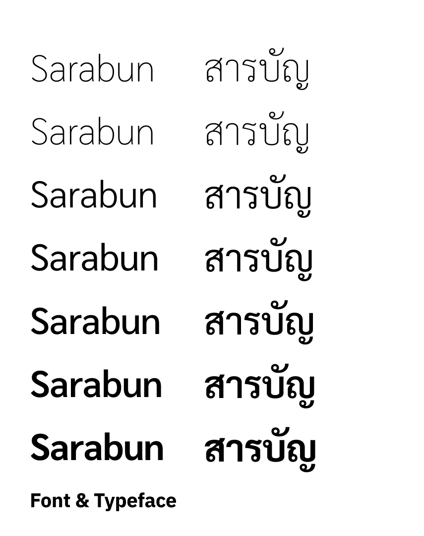
A Thai-English font was chosen to reduce app loading times on multiple glyphs. Sarabun in specific because its sans serif nature proved to suit the app’s minimalistic styling.
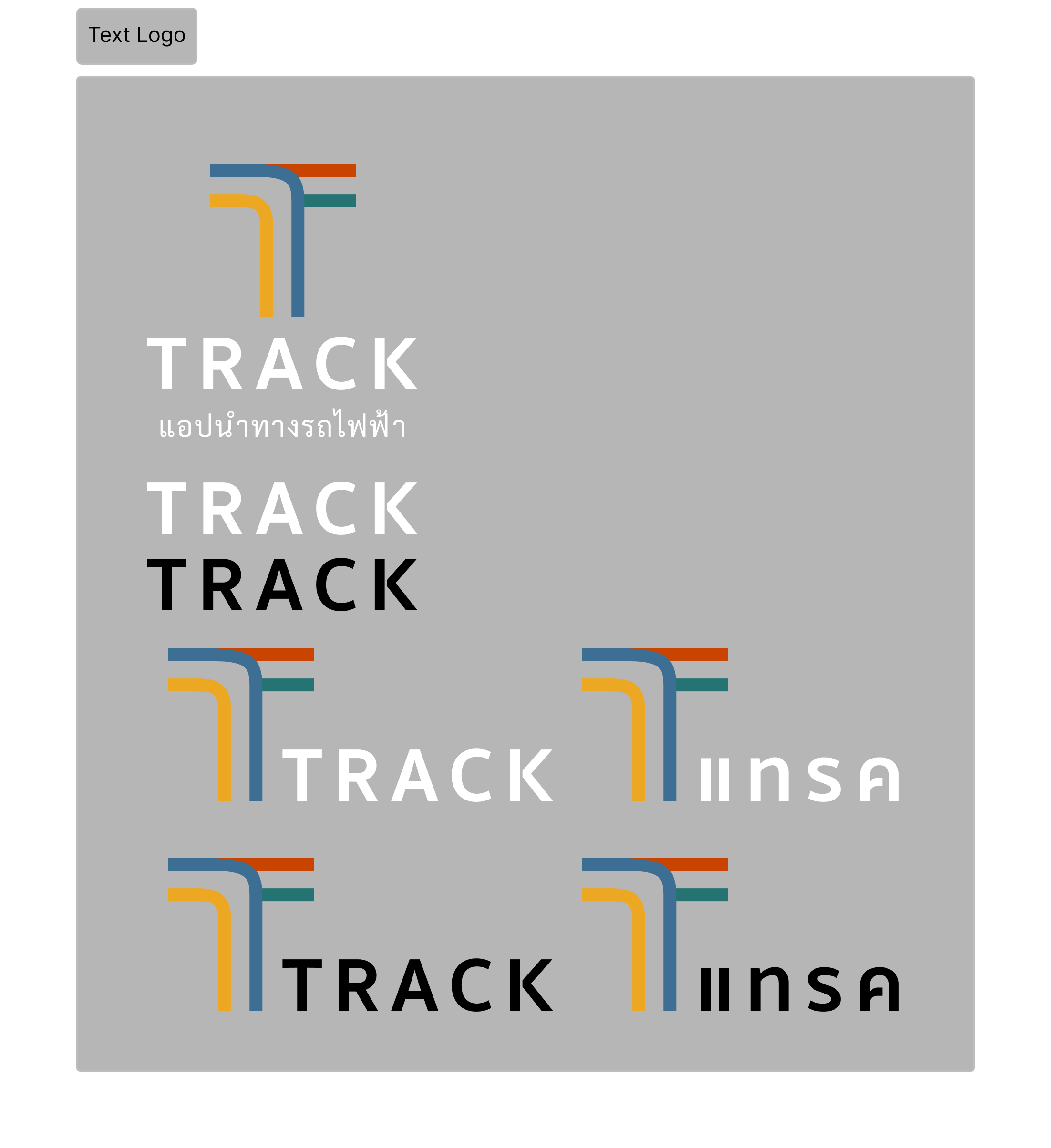
The name “Track” was chosen as a double enténdré, for its meaning as [Train] Tracks and Track [and trace]. This is the gist of what the whole app does, in one word.
The logo was designed based off the idea of train tracks intersecting. With the 4 major train line colors adorning it, Track truly becomes a piece of the Bangkok ecosystem.