Introducing:
ZING
Bangkok’s one and only self learning navigator app
Designed for Metamedia Technology Ltd (Bangkok, Thailand)
Responsibilities:
Product Designer
UX & UI Designer
Interaction Designer
Brand Strategist
Tools:
Figma
Adobe Photoshop
Adobe Illustrator
Miro
Jira
Results:
4.5/5 satisfaction rating from users
Delivered UX prototype to company and stakeholders
WHAT’S THE PROBLEM?

The Bangkok Metropolitan Bus system is complicated.
Very complicated.
The only map (left) that is readily available was drawn on paper with markers by a first grader.
01: User Understanding
Here, I interviewed 15 individuals found on and near the bus in Bangkok and and derived 3 different personas
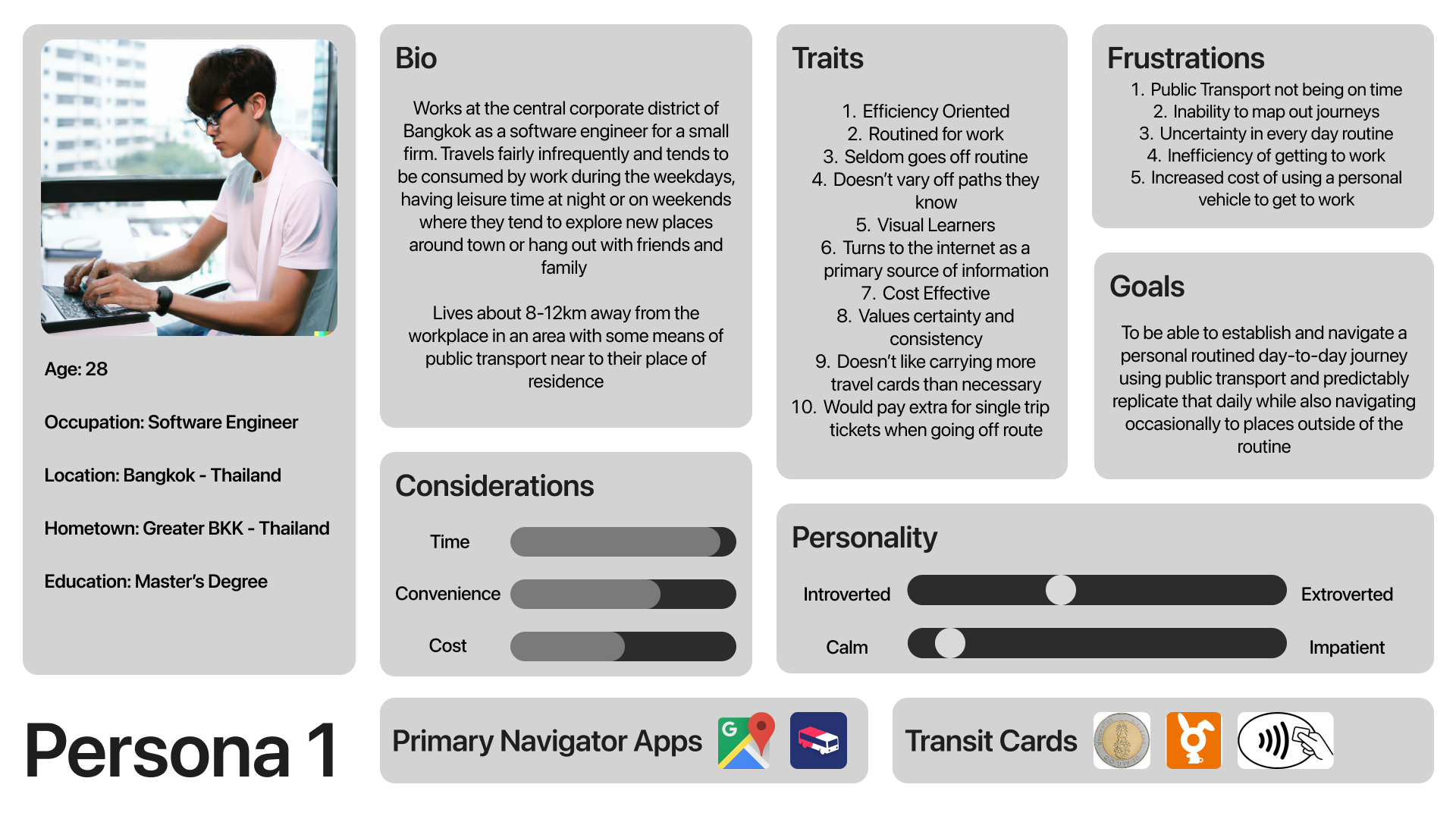


This empathy map is the culmination of all my persona-based research and user interviews
The main value propositions of the users can be summarized into 3 main categories when it comes to using public transport
Cost
Time
Convenience
Some users may value certain aspects more than others, leading to a need for a self learning app - in addition to Bangkok’s own complicated public transport system.
From here, we are able to roughly form an image of an app that can be used to display such information and create a means for the users to navigate comfortably.
DESIGN OBJECTIVE:
To design an app that allows for novice users to navigate Bangkok using the local bus system at their own pace, optimizing time, money or comfort
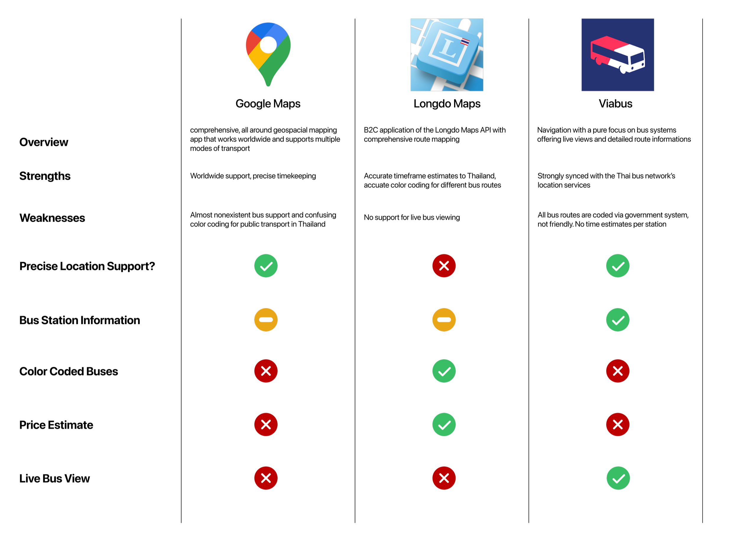
Here, I compared 3 existing competitor apps for their efficacy in the purpose of navigating with the bus. The apps I chose were based off download numbers in the app store and the interview populous who used these apps.
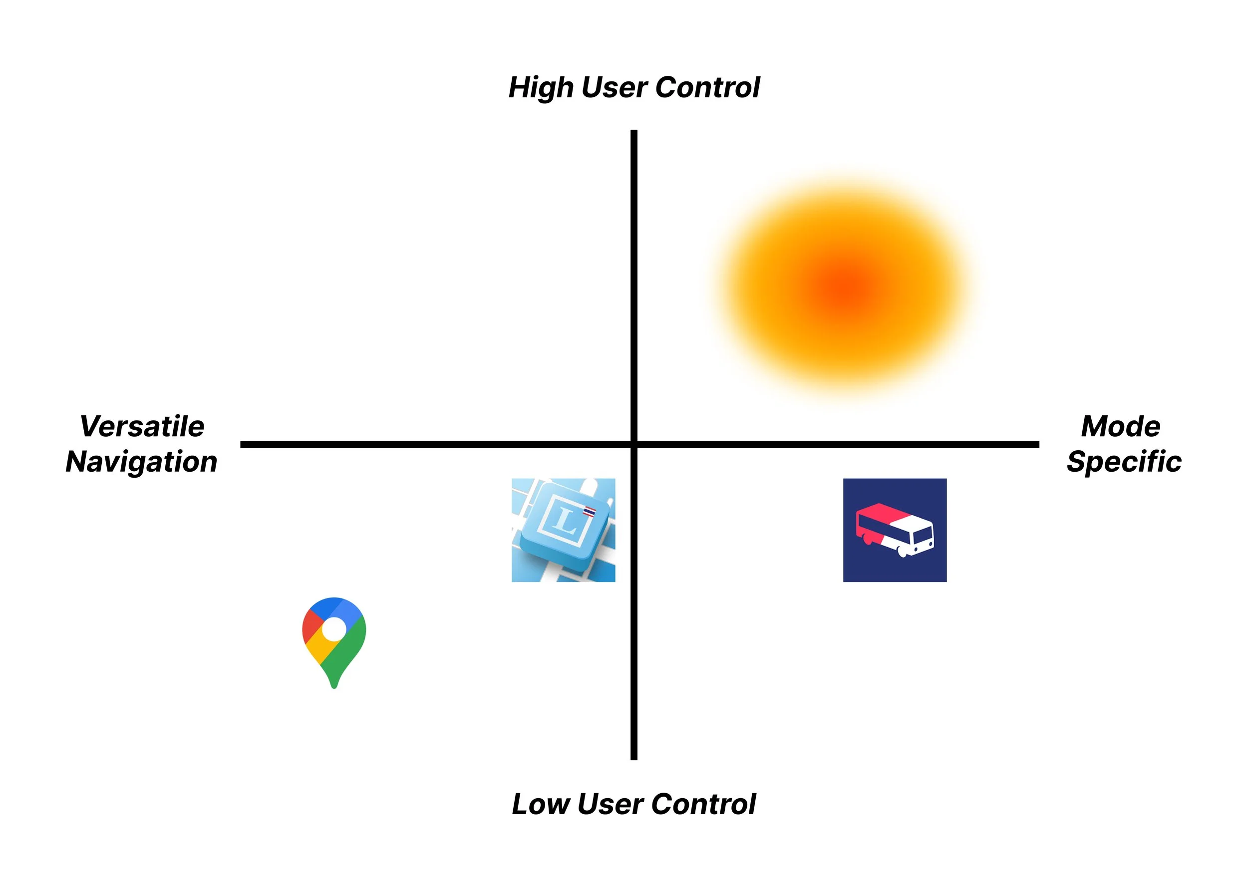
Combined with the evident want of the user base for an app with high user control in how they want to traverse using the Thai bus for various priorities (cost, speed etc), a market vacancy can be observed in Thailand.
02: App Navigation

3.01 Signups
In order to sign up for this app, a short questionnaire will be used to gauge and understand its users.
Qualitative questions about priorities quantitative data about speed will be gathered in order to determine their best route
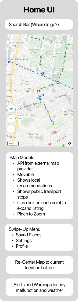
3.02 Home
Powered by Longdo Maps’ own API, the map will be the primary element of the home screen. Elements of the maps (places, stations) can be clicked on for further details.
Buttons surround the map, such as recentering and alerts
Built around the map, other functions live as “stacks” in the form of swipe-up menus

3.03 Search
Once a route has been determined, the app will calculate routes based on your preferences with cost and ETA to get there.
Here, a specific route will be chosen

3.04 Navigation
A route was chosen, a detailed overview will be displayed as an overlay on the map before the user can click to confirm.
03: Prototyping

This is a sample iteration of the home page and navigation options page with room for ad sponsorships.
The maps, open sourced from OpenStreetMap allows for specific location sharing with accurate streets all over the world. The UI meanwhile, seeks to be as unobtrusive to the user as possible, showing the maps as the main interface at it intends to be a navigator app above all. In this case, the user’s profile settings are front and center while the search option is easily accessible.
New color coding schemes have also been assigned to each bus route to differentiate them by endpoint and direction.
SNAGGED!
Here, a simple check-in with my supervisors and peers had led me to hit a snag in my design process.
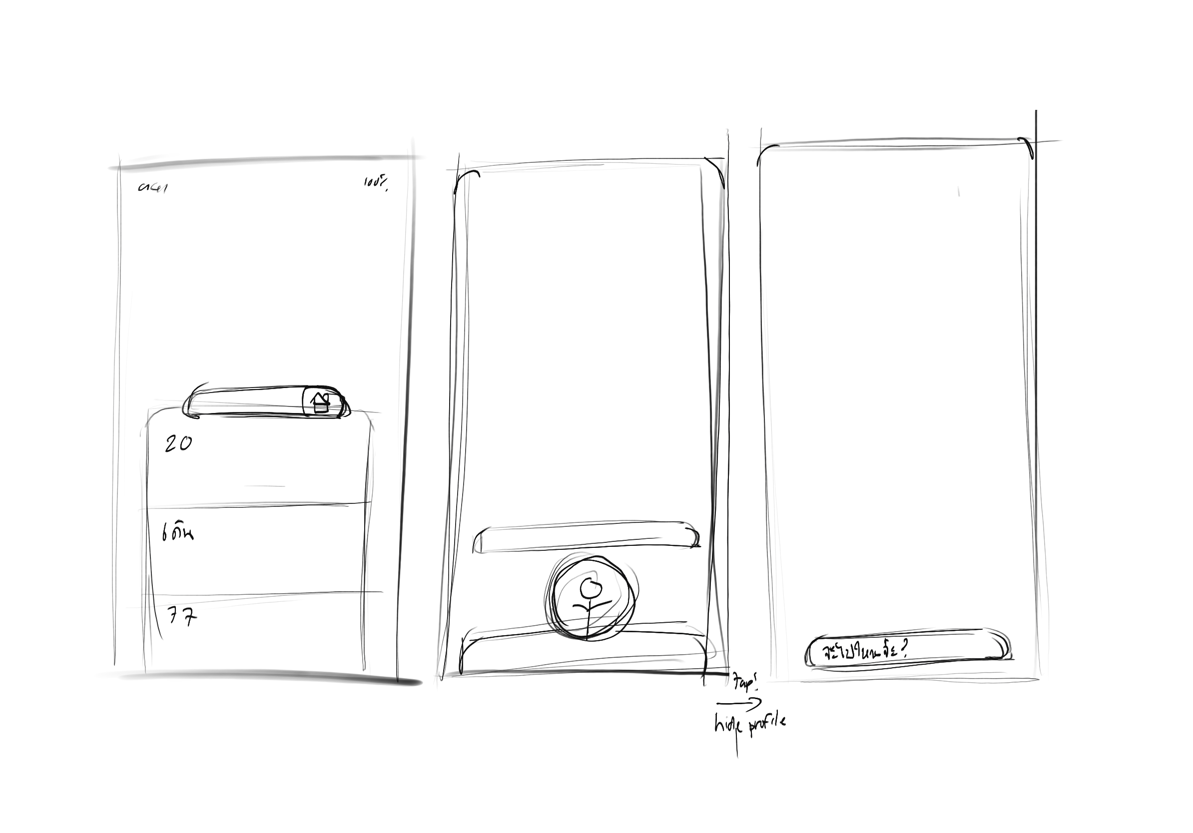
Initially, I presented design A for the floating home page of the app, showing a majority map design and prominent buttons for search, saved places and settings to a team of colleagues, product managers and senior UXUI designers in the field
The feedback was that it was highly collapsed into the bottomside of the screen, instead becoming harder to access by the thumb in order to search for a specific location or to access saved places.

A
After conducting A/B testing with 10 different individuals of non-design backgrounds who constantly use navigator apps, the general consensus leaned towards design B, showing a clear trend towards usability and thumb positioning. Furthermore, the extra “cards” on the bottom were noted as a welcome addition to the home interface, showing exactly where the nearest stops are using live location as a good use of space.
For Design B, I took all that into account and decided to intentionally expand and segment what was one block into “modules” onscreen, showing more options while allowing for the map to remain prominent without being sandwiched.
B
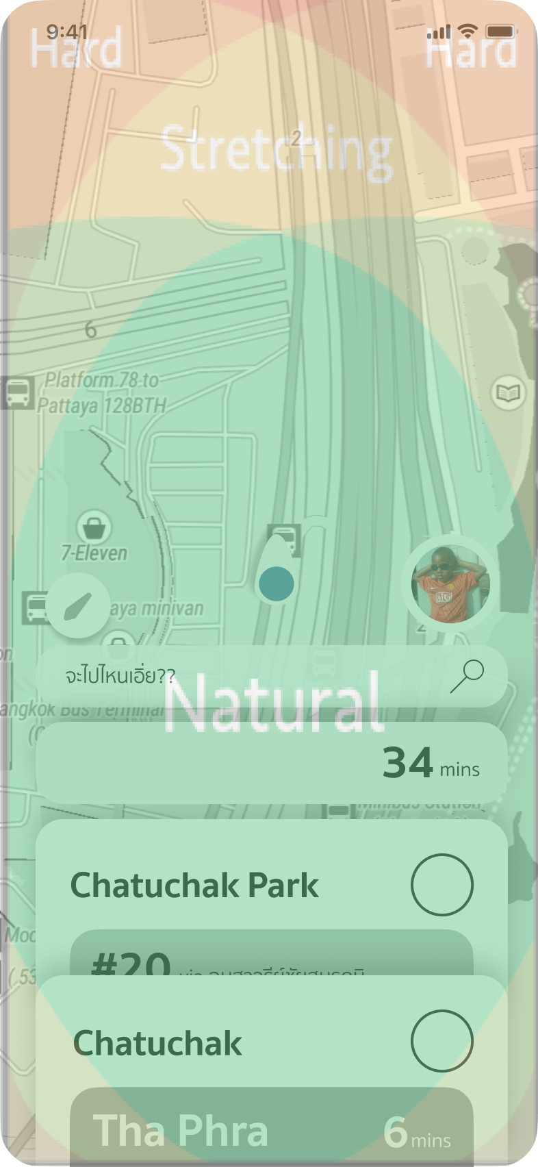
Upon testing with ergonomic logic of thumb positioning on the screen (iPhone 6’1 inch as a reference), it shows all the critical touch points remain within the “natural” circle, showing compliance to the laws of ergonomics.
04: Artistic Direction & Moodboard
Here, the map of Thailand’s bus system reveals a series of different colors and convoluted networks across greater Bangkok without much color coding or intentional planning to organize it. The most expansive and detailed map of the Bangkok bus system remains (to this day), a hand-drawn map with markers on paper by an elementary school child.
This information is pivotal in realizing just how much information is communicated to the user, and what can be constituted as “important”


Card Games were used as the main visual inspiration for the user interface.
With the limited visibility in a card hand, UNO and Solitaire use color and type to summarize the information about any given card with just a glance at the top
Zing takes advantage of this by using a stacked UI design to create an organized viewing experience without overwhelming the user with information.
Enough of the the other information can be gleamed from the top of the card, such as the mode of transport and a glimpse of the next train.
As Bangkok’s transportation lines are largely color coded, the colorful and recognizable nature of UNO serves as inspiration for its ease of recognition and visual hierarchy
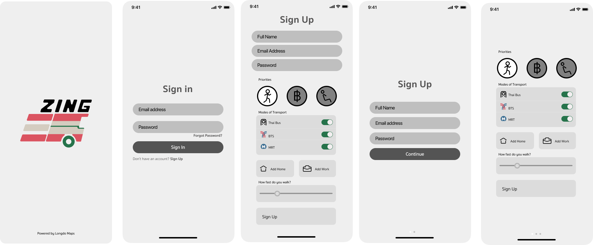
The app opens with a small preferences quiz that gauges the user’s personal habits and can tailor routes using data the user has provided to create the best route
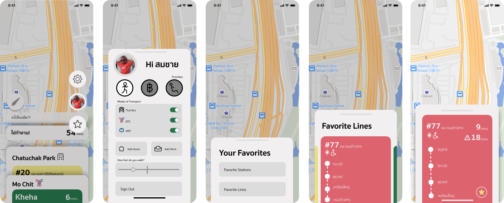
The UI meanwhile, seeks to be as unobtrusive to the user as possible, showing the maps as the main interface at it intends to be a navigator app above all.
In this case, the user’s profile settings are front and center while the search option is easily accessible.

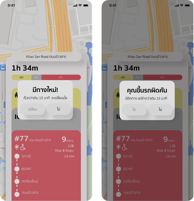
In order to facilitate the dynamic nature of travel using public transport, the app can also change the route midway to facilitate faster travel.
If a significant change is needed, the user will be prompted with a choice to accept a new route or keep with the old one
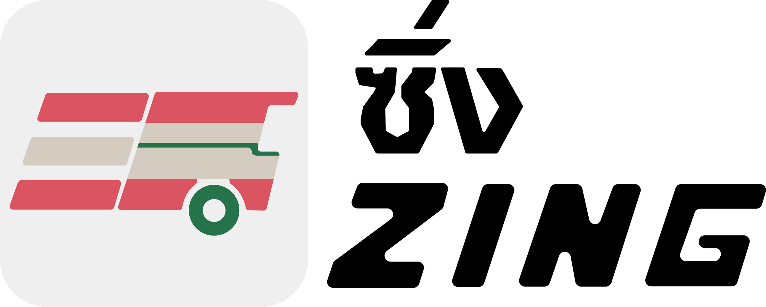
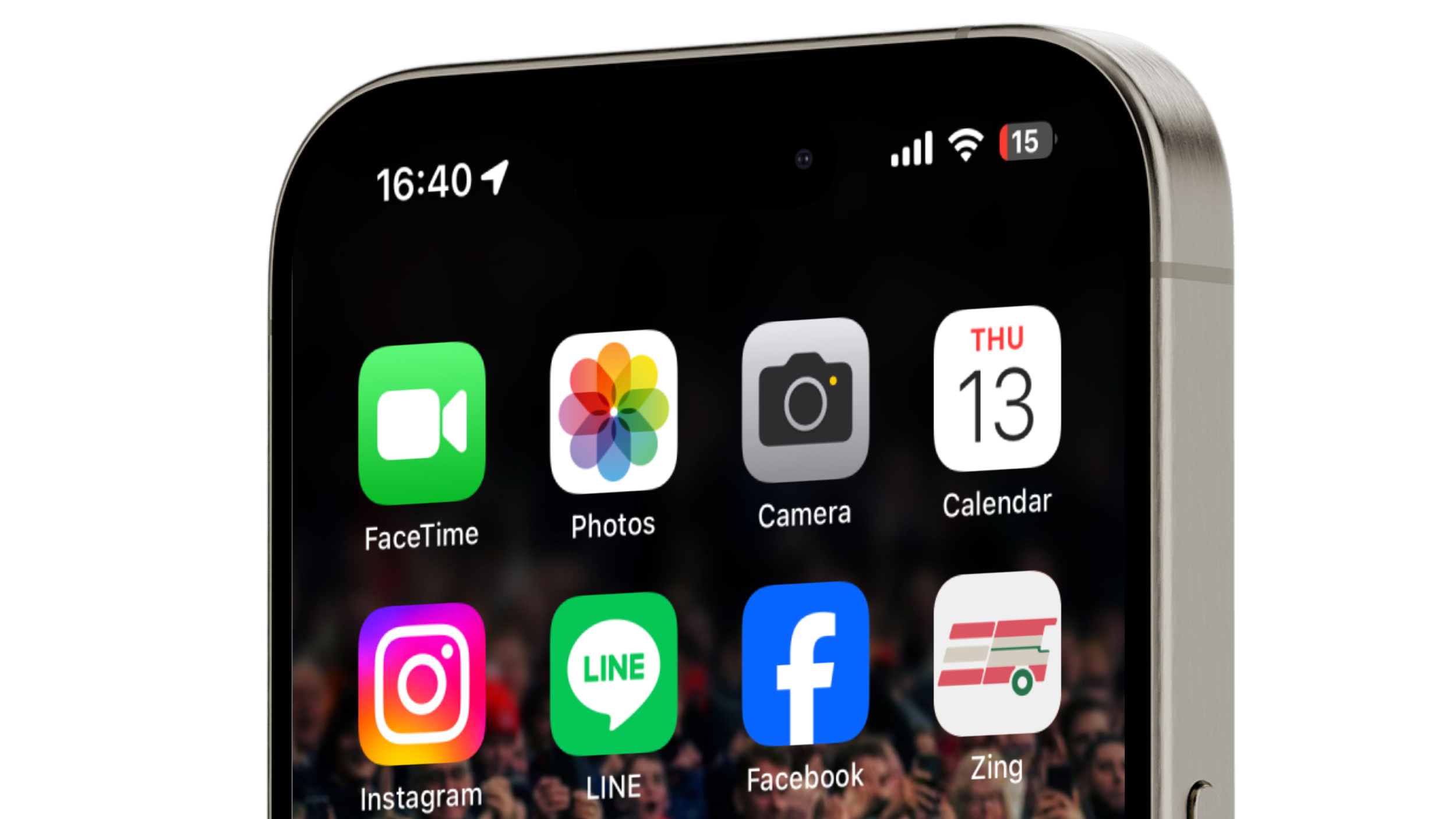
05: Logo Design

Inspired by the classic look and color of the Thai bus, the logo of the app should invoke speed and timeliness, hence the forward moving of the bus.
Each iteration is evocative of size, motif and the degree of resemblance to the Thai bus aesthetic while also balancing the Z in Zing.